Crime on public transport in London
Another day, another dataset.
Today's data is crime rates on the TfL transport network.
The data whilst published as one dataset is derived from two different sources -British Transport Police and the Metropolitan Police. The Met are responsible for bus related crime and BTP for rail (heavy and light, over and underground). The Met doesn't have a category for bus crime, rather it runs various searches on crime reports for certain words, namely bus and bus stop, so may under or overstate 'bus' crime.
As with most crime data, we have the absolute number of crimes reported and the crime rate. The crime rate is expressed as number of crimes per million passenger journeys, so is not comparable to standard crime rates of 'crimes per thousand residents' which I refer to elsewhere.
I should also caveat that these figures are for ALL crimes, so in comparing the crime rate, we might find equal levels of crime on the bus and tube, but if all of the bus crime is theft whilst all tube crime is murder - I know I'd rather be on the bus, but from this data I wouldn't be able to make that call.
So, where to begin? I will be answering the following questions:
 There was 11.6 per cent reduction in reported crimes on all forms of transport in March 2013 compared to April 2009 with the number of crimes reported in those months falling from 3,341 to 2,953. Annually (financial year) the number of crimes reported has fallen from 40,570 to 34,510, or a 15 per cent reduction.

Because there were changes to the integration of the Overground and measurement of journeys, the number of journeys for the Overground isn't available pre 2011 and a crime rate can't be calculated. In looking at the overall rate I have excluded overground crime pre April 2011, but included it for periods we do have.
Looking at the change in rate from April 2009 to March 2013, the rate fell from 12.1 crimes per million journeys to 9.1 per million journeys, a fall in the rate of nearly a quarter (24.5 per cent). If we exclude the overground completely, the reduction is slightly smaller 23.4 per cent.

 You can see the danger of using point measures of crime, as as we will see there is significant fluctuation in crimes, particularly on the Tramlink. However, because of the fewer journeys on both Overground and Tramlink, any fluctuation in the number of crimes affects the crime rate more.


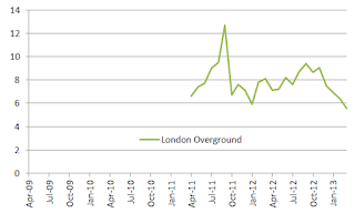
Calculating the crime rate over a rolling, three month period, suggests a marginal downward trend, but not conclusively. However, the Overground was the mode of transport with the lowest crime rate and as noted above, as significantly fewe people make journeys on it more susceptible to spikes.

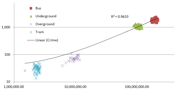
In part we have a problem that we know that the rate of crime is decreasing, even though the number of journeys are increasing, which is a result of both a) more journeys and b) less crime. Surely then, crime decreases with increased journeys? Well no. If you plot the data points for all four modes as a single series, what you get is an R square value of 0.96 - showing an incredibly strong link between the two.
In the chart below, you can see this relationship. In part, this apparant contradiction is because there is a certain degree of steadiness - neither crime nor journeys are that variable over a relatively short period.

So I bunged the numbers into a regression. Each month was coded 1-48 (April 2009 was 1, March 2013 48), so that I could control for changes due to reduction in crime as a factor of time.


Today's data is crime rates on the TfL transport network.
The data whilst published as one dataset is derived from two different sources -British Transport Police and the Metropolitan Police. The Met are responsible for bus related crime and BTP for rail (heavy and light, over and underground). The Met doesn't have a category for bus crime, rather it runs various searches on crime reports for certain words, namely bus and bus stop, so may under or overstate 'bus' crime.
As with most crime data, we have the absolute number of crimes reported and the crime rate. The crime rate is expressed as number of crimes per million passenger journeys, so is not comparable to standard crime rates of 'crimes per thousand residents' which I refer to elsewhere.
I should also caveat that these figures are for ALL crimes, so in comparing the crime rate, we might find equal levels of crime on the bus and tube, but if all of the bus crime is theft whilst all tube crime is murder - I know I'd rather be on the bus, but from this data I wouldn't be able to make that call.
So, where to begin? I will be answering the following questions:
- Has the overall level of crime changed across the network?
- Has the crime rate changed across the network?
- Which mode of transport is the safest?
- Is my journey getting safer, more dangerous or the same?
- Does the number of crimes increase with the number of journeys made?
Q: Has the level of crime changed across the network? A: Yes, the number of reported crimes has dropped.

Q: Has the crime rate changed? A: Yes, the number of reported crimes compared to the number of journeys has dropped.

Looking at the change in rate from April 2009 to March 2013, the rate fell from 12.1 crimes per million journeys to 9.1 per million journeys, a fall in the rate of nearly a quarter (24.5 per cent). If we exclude the overground completely, the reduction is slightly smaller 23.4 per cent.
Q: Which mode of transport is the safest? A: Overground

Comparing crime rates at three points we can see that the Overground looks to be safest with a substantially lower crime rate.
However, these are for invidual months. Looking at all of 2012/13 the rates are:

Is my journey getting safer, more dangerous or the same? A: Most likely safer but depends
Looking at the number of reported crimes, there is a reasonably steady reduction in the number of crimes reported relative to the number of journeys. However, Tramlink is very erratic, but demonstrates an overall downward trend. The Overground experienced one large spike, but otherwise shows little evidence of a trend.


Calculating the crime rate over a rolling, three month period, suggests a marginal downward trend, but not conclusively. However, the Overground was the mode of transport with the lowest crime rate and as noted above, as significantly fewe people make journeys on it more susceptible to spikes.

Q: Does the number of crimes increase with the number of journeys made? A: Sort of yes. Sort of no. But probably yes
If one plots the number of crimes (y axis) against the number of journeys (x axis) for each of the four modes of transport, you basically get a cluster of points which shows relatively little evidence of correlation, with the exception of the Overground, where there is a decent relationship, driven in part by the relatively sharp rise in the number of journeys.In part we have a problem that we know that the rate of crime is decreasing, even though the number of journeys are increasing, which is a result of both a) more journeys and b) less crime. Surely then, crime decreases with increased journeys? Well no. If you plot the data points for all four modes as a single series, what you get is an R square value of 0.96 - showing an incredibly strong link between the two.
In the chart below, you can see this relationship. In part, this apparant contradiction is because there is a certain degree of steadiness - neither crime nor journeys are that variable over a relatively short period.
So I bunged the numbers into a regression. Each month was coded 1-48 (April 2009 was 1, March 2013 48), so that I could control for changes due to reduction in crime as a factor of time.

The results of the regression are striking- R square of 0.99 and all of the p-values are very very low, suggesting the probability of a relationship being random for all variables unlikely. So, we know that crime is definitely going down with time (negative coefficient), but also increases with the number of journeys (positive coefficient) , and the resultant crime rates are affected by both factors.


Comments
Post a Comment
Please leave a comment to let me know if you think I've got it totally or partially wrong!