Creating maps in Excel pivot tables
When I can't be bothered doing something because it's too much hassle, I like to find a work around and data analysis is no different. When I was looking to plot fire brigage data onto a map, I faced having to convert 23,000 coordinates from the Ordnance Survey National Grid into the cartographic map projection used by google maps if I would be able to plot them without buying some fancy pants GIS software. Using my knowledge of MS Excel, I was able to achieve exactly what I wanted to in less than five minutes.
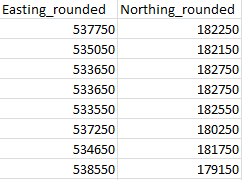
This particular project was very simple, because each line of data had coordinates which were rounded to the nearest 100m, which you can see below:
Next, I created a pivot table, using the northings and eastings as the row and column labels. I used the 'incident number' as a 'value', setting it as a count (as I knew every incident would have this completed.


I then, adjusted the column widths and row heights to be the same, so that each cell was a square and then used Excel's conditional formatting to apply colours on the basis of the value in the cell.
So, in a few simple steps, I had a nicely formatted and informative map showing where the greatest density of incidents were to be found.

Thi


Comments
Post a Comment
Please leave a comment to let me know if you think I've got it totally or partially wrong!